The Project
A fast and easy Mexican restaurant app with fast ordering and reliable delivery system for the best user experience in our local community.
Duration: 6 months
Methods: Interviews, Affinity Mapping, Persona, Wireframes, Prototyping
Tools: Adobe XD, Adobe Illustrator
Context
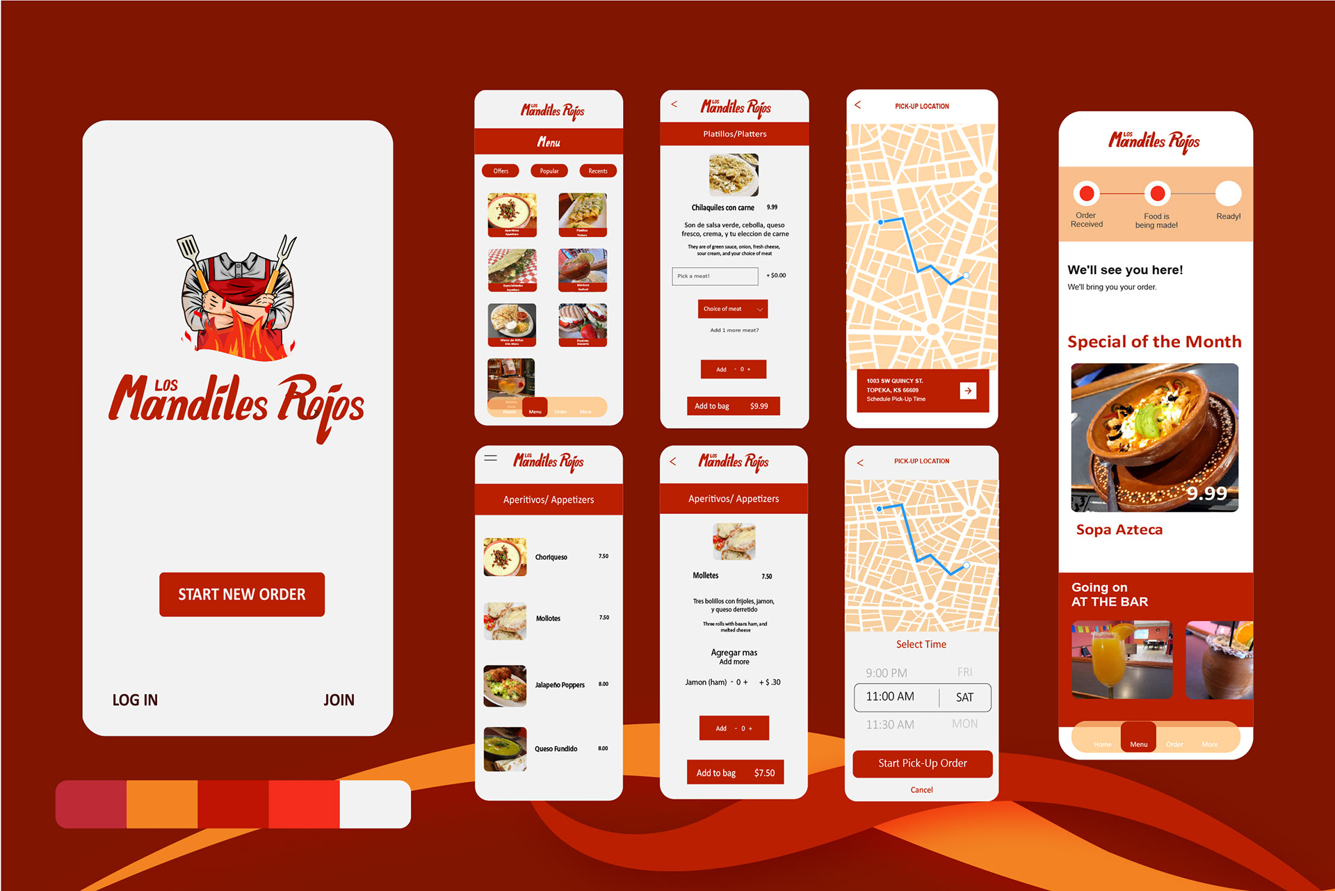
I designed a mobile application for “Los Mandiles Rojos”, a Mexican restaurant in Topeka. I am motivated by the mission of this family-owned restaurant to share their culture through food while also giving back to the community.
The Process
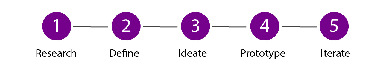
Research
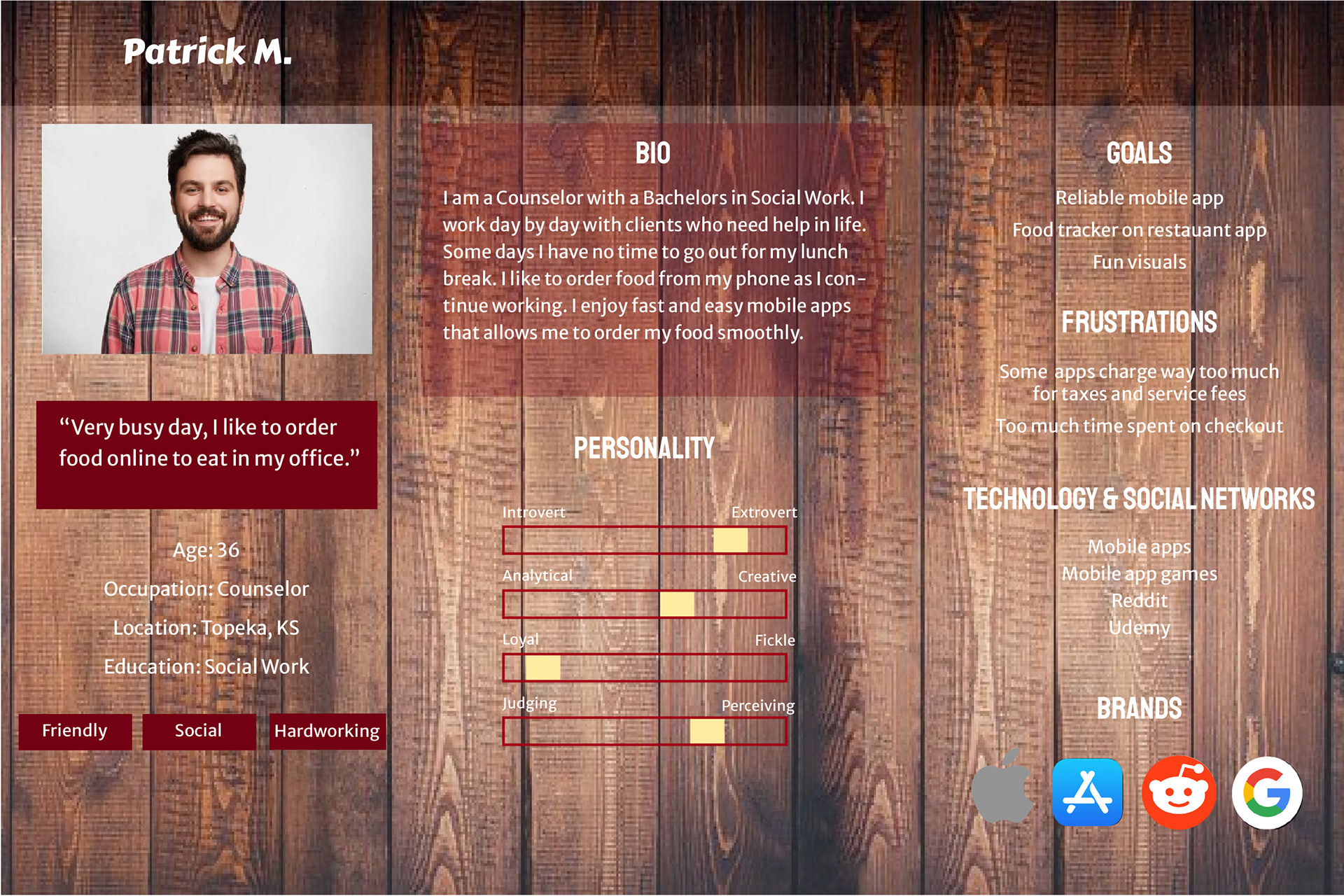
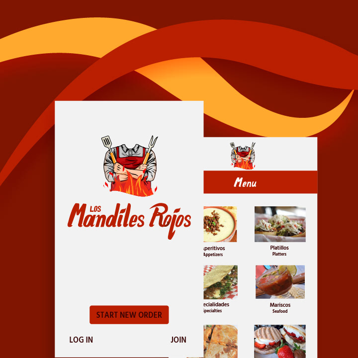
My work started by working on creating a design brief of the mobile app design process to figure out the expectations of the mobile app. Secondly, I conducted two in-person interviews with a couple coworkers and received very helpful insight on mobile apps for restaurants, thus I created a persona that breaks down an ideal target audience perspective. Third step was creating a mood board for the mobile app give the audience the feel of the mobile app. The next step was sketching and planning the best layout for the page flow of the mobile app that helped me move to my next step which was creating the low fidelity wireframe. The low fidelity wireframe allowed me to test the user flow of the app and so I made a few changes for the high-fidelity wireframe to make it easier and a faster food ordering and payment process.
Define
I started with a goal on paper and worked my way to designing and going through the process of designing a mobile app. I learned the initial steps into creating an effective and enjoyable app design for the target audience of the Mexican restaurant. What I would do differently is if I had more time on my hands to do more market research on other competitors and go through each image to edit and make it more appealing.
Task Analysis
I conducted a Low fidelity wireframe to gain insight as to how users might expect the content to be organized and displayed and used the results to create a sitemap.
Ideate
Low Fidelity Wireframes
I wanted to create a limited number of screens as possible since the goal for this project is to be useful, easy, and fun for all ages. I started with pen and paper wireframes and created multiple versions of each screen until I found the right features and elements needed by the users.
Test
Usability Testing
Now comes the joyous moment of conducting usability tests. I was able to refine features that were considered useful and completely change up what did not fit well.
Iterate
Design Changes
I made changes based on feedback from my professor and fellow designers. I created a newer high-fidelity version of the app that featured larger icons, decent colors that weren't too distracting and clearer text.
I applied the gestalt principles, color theory and made sure the designs stated consistent and which ones correspond to the right space.
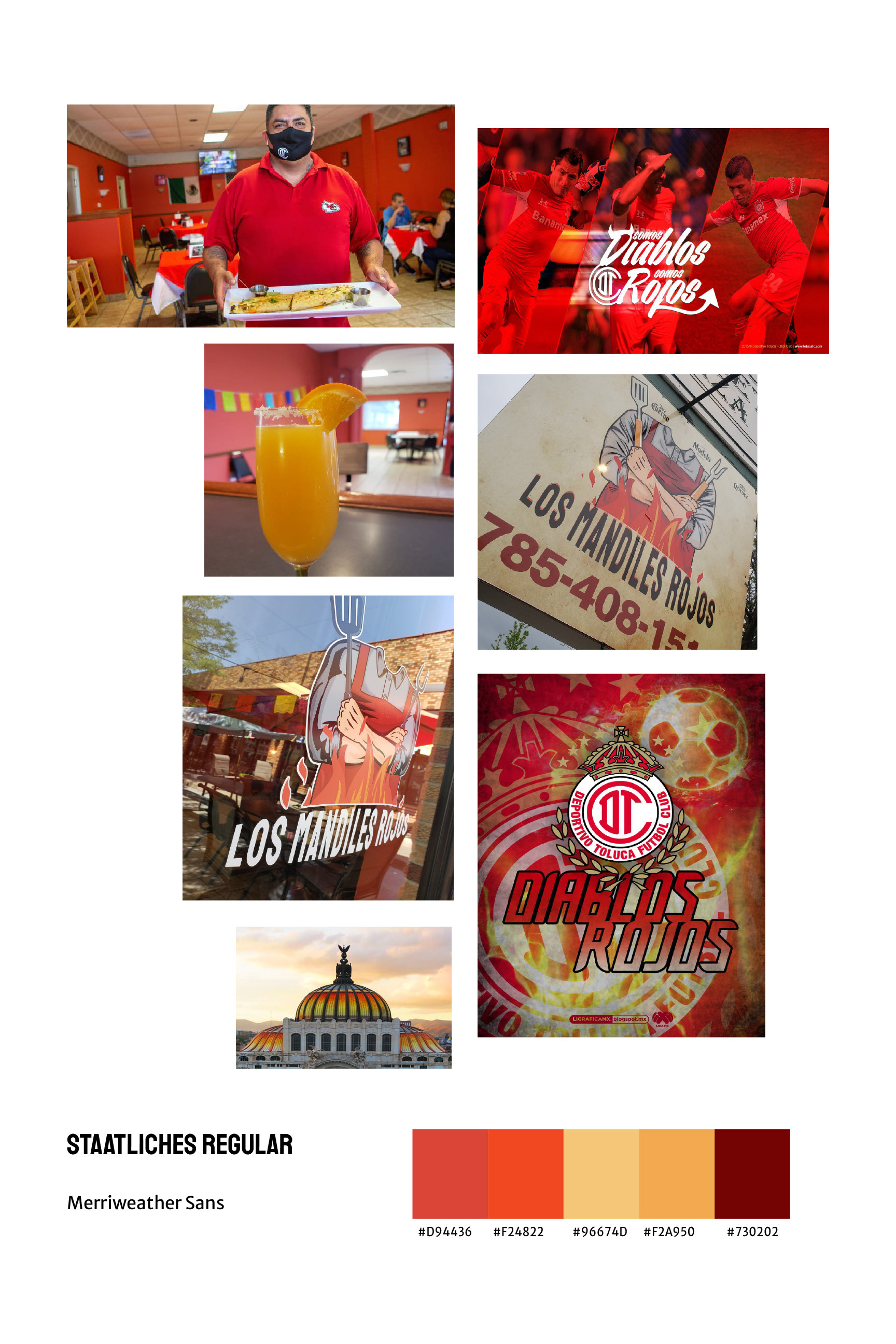
Mood Board
Final Product
After many tests and iterations, the design was changed to be more eye appealing. Removed many un necessary buttons.
Retrospective
Challenges
My biggest challenge was a struggle with visualization for the user's profile. Making sure each icon has its clear purpose for the user to easily understand and also displayed beautifully.
This pushed back my timeline somewhat, and I could not spend enough time on some other aspects of the design, such as text.
What can be improved?
I only used Adobe XD and Adobe Illustrator for this project, for everything from my wireframes and prototypes to creating illustrations and icons.