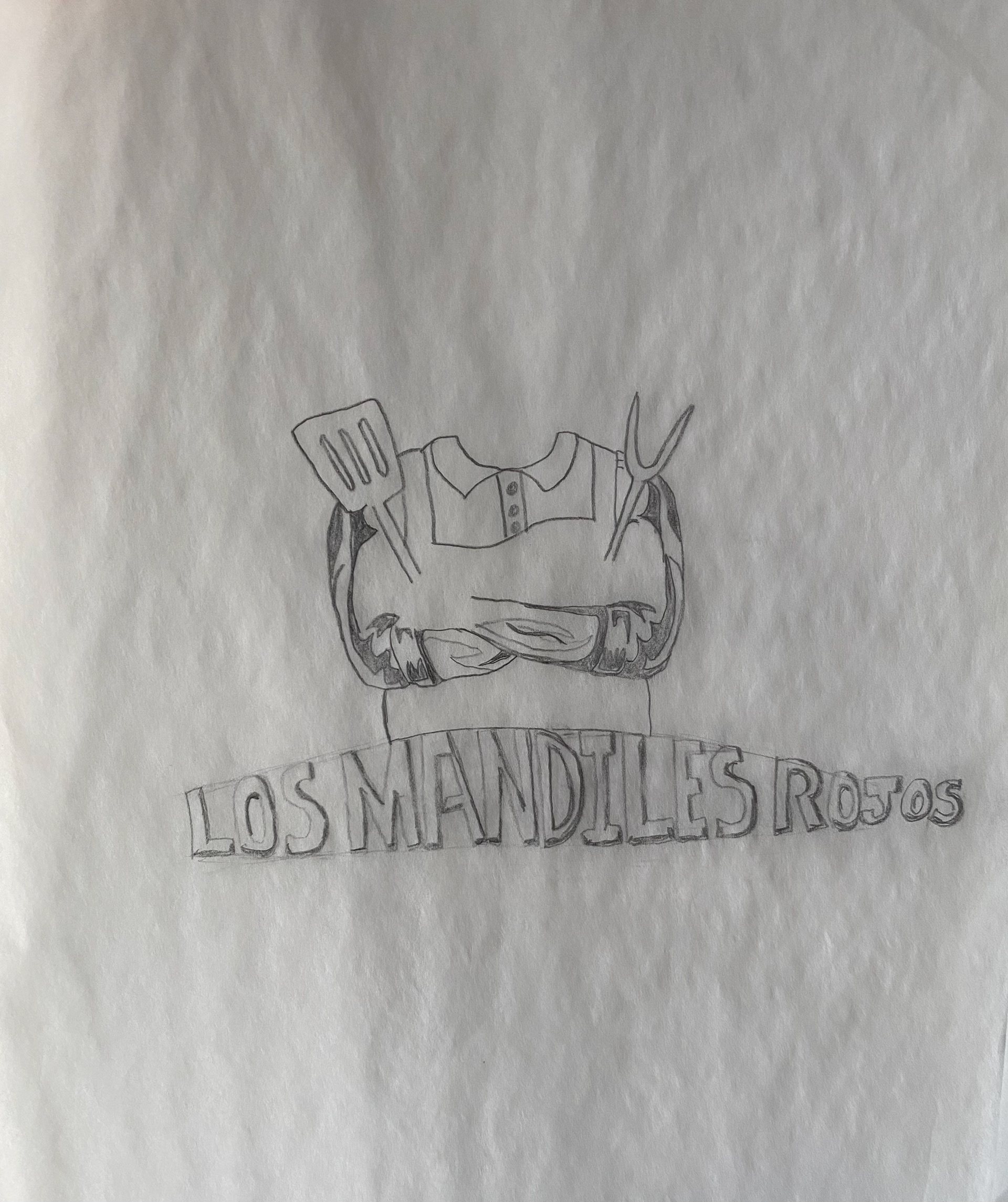
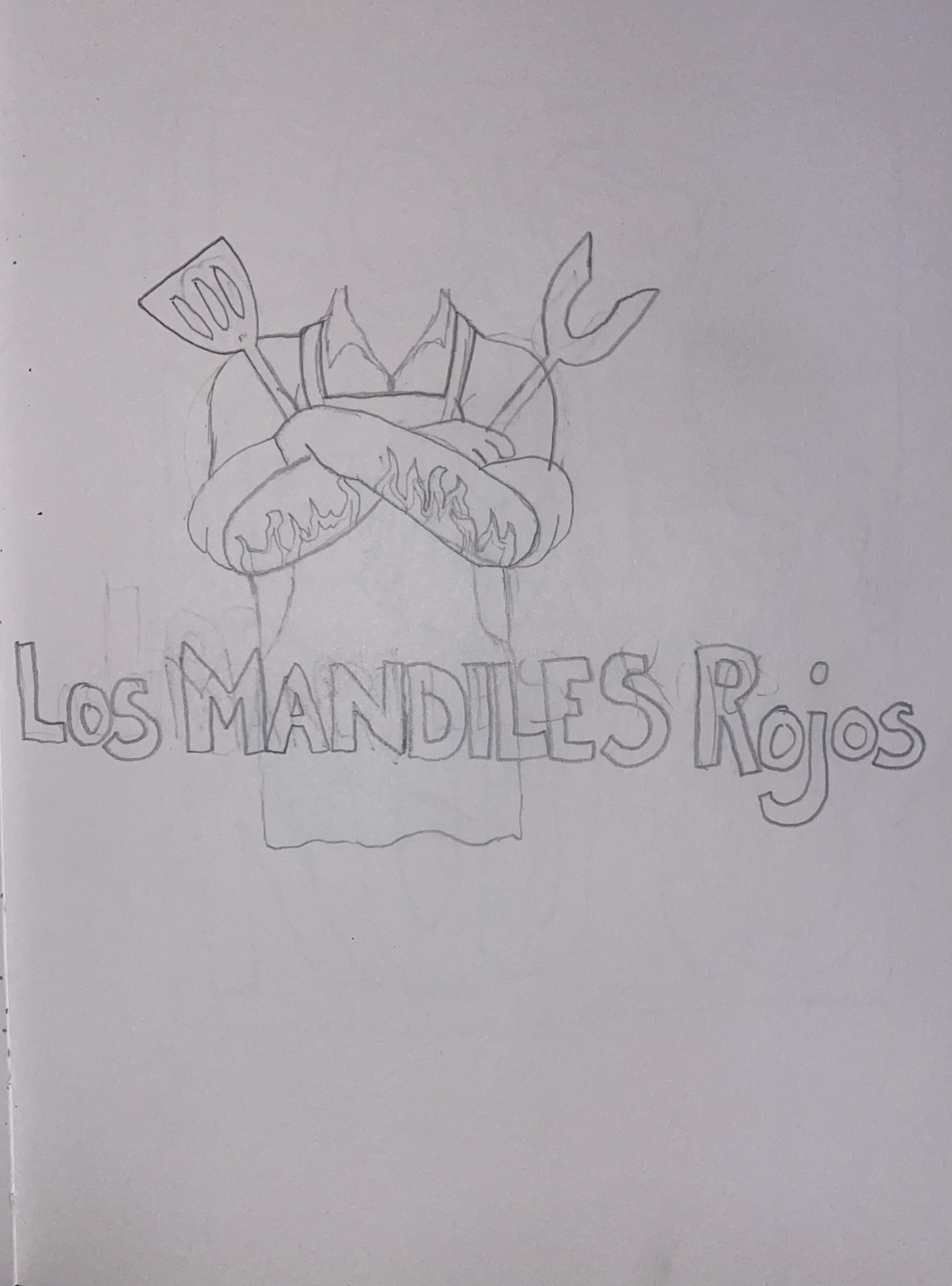
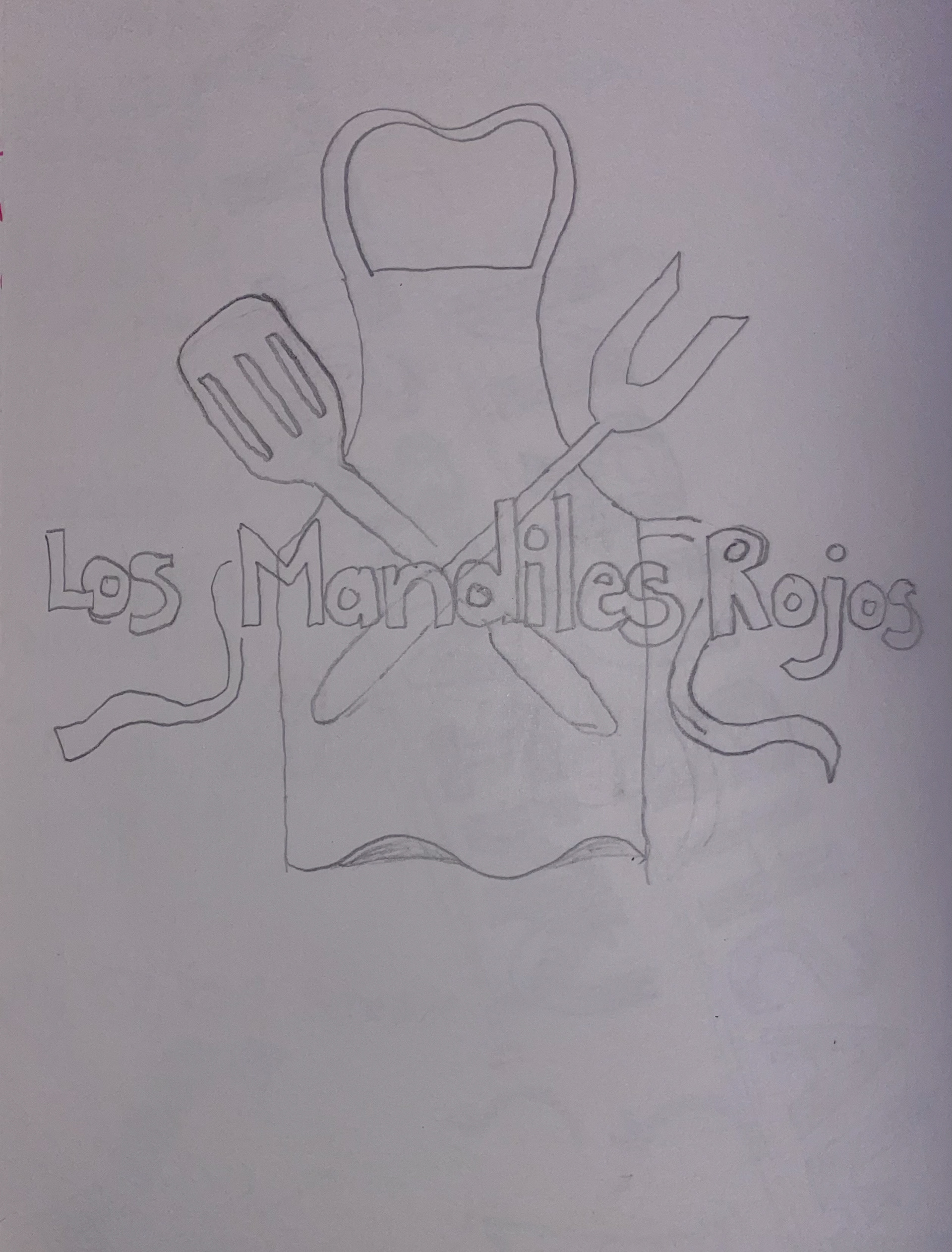
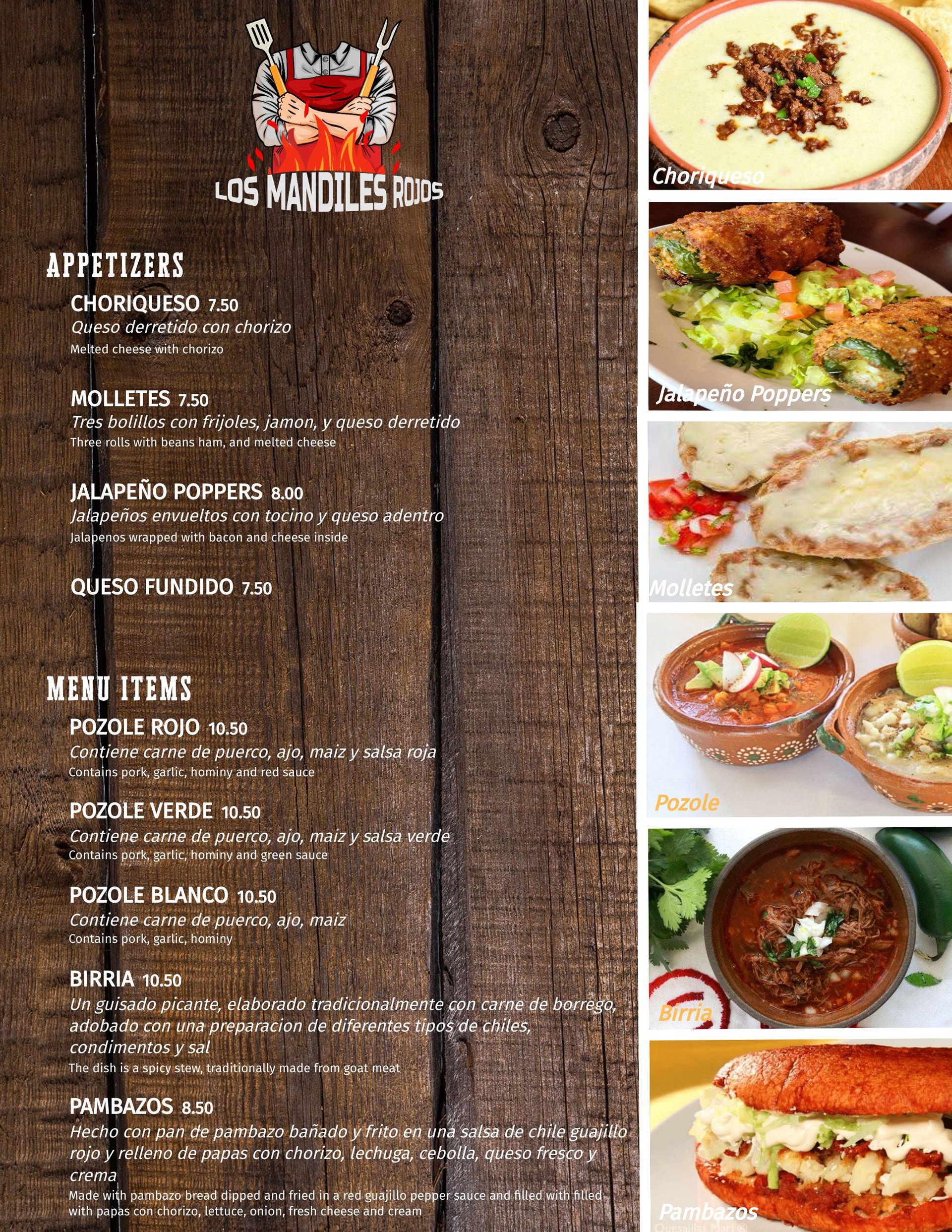
Client branding identity for this successfully launched Mexican restaurant, created with creativity and inspiration. I was inspired by the family environment of this restaurant whilst consulting with the owners.
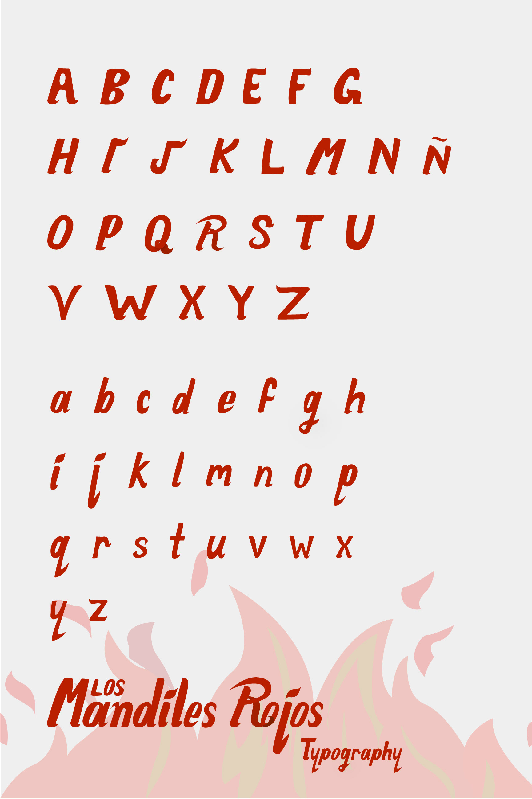
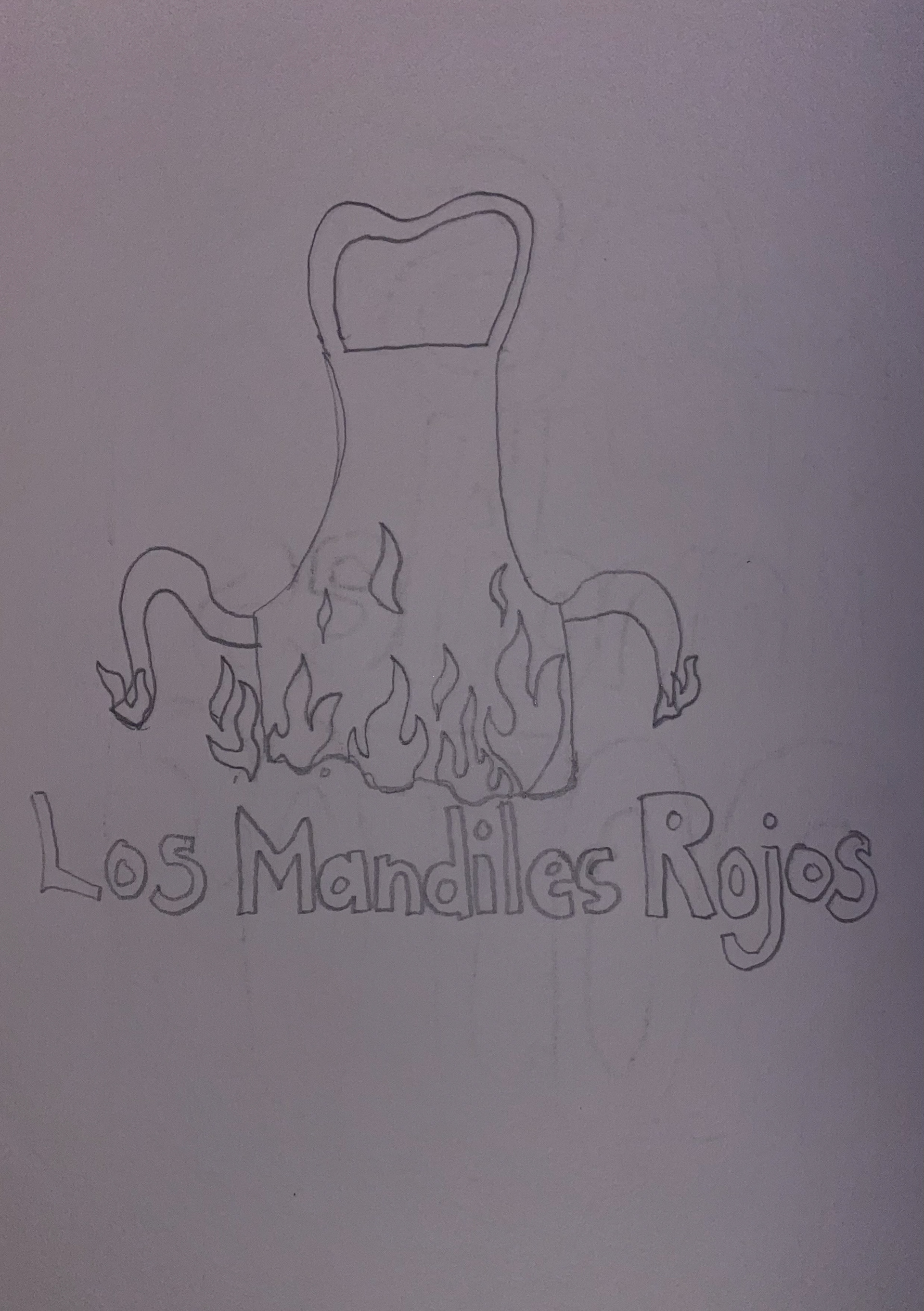
The Spanish name "Los Mandiles Rojos" translates to "The Red Aprons" in English.
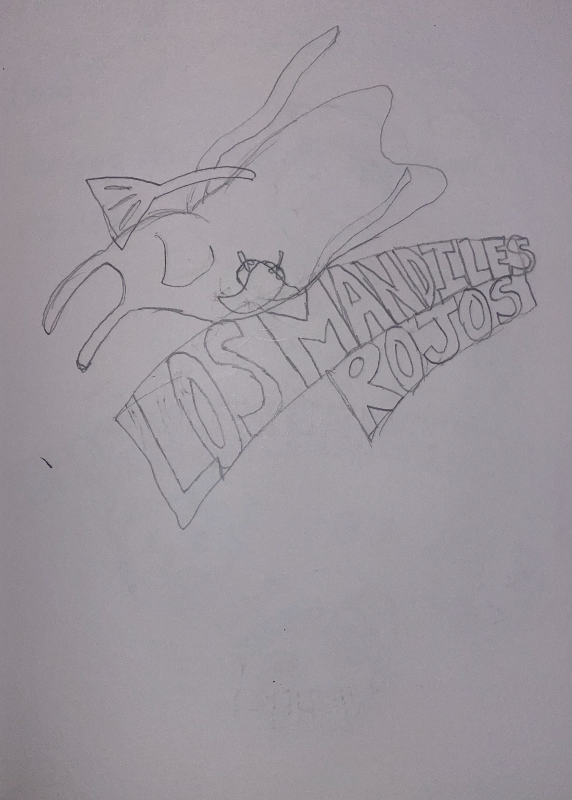
My process begins by sketching a variety of ideas that gives me the feel of this family owned business and their culture. While working alongside the owners making sure my designs meet their satisfaction, I also had help from my mentor from Washburn University whom gave me helpful feedback to improve my design.
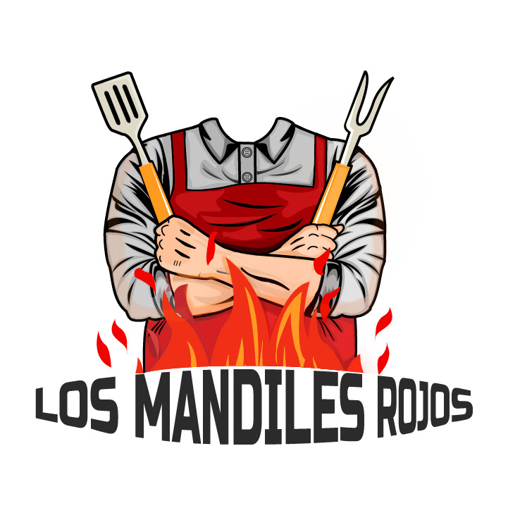

Updated Logo Typeface