
The Project
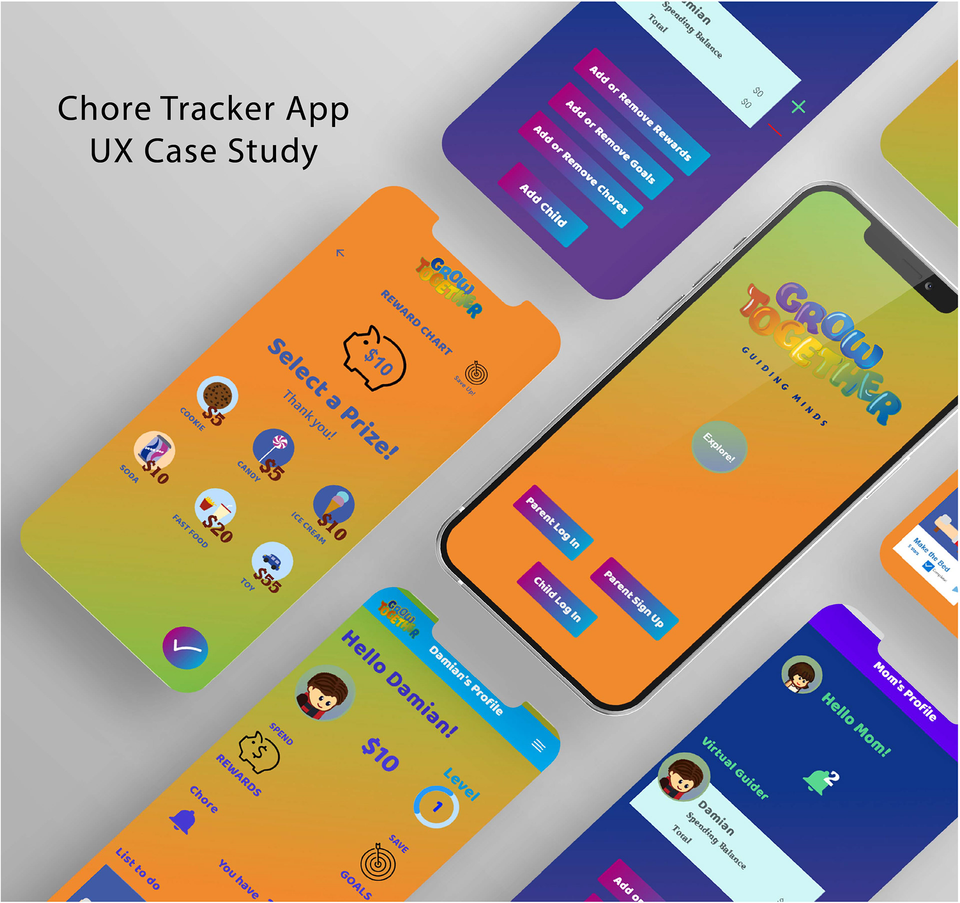
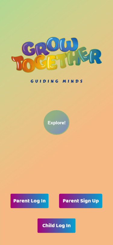
Grow Together is a virtual allowance/points tracker app. It offers separate accounts for parents and kids. Allows the parent to send allowances/points to your kids, show them how to save for future purchases, and helps teach kids responsible habits by completing home chores and earning allowance/points.
A fun and learning experience for the whole family!
No subscription fee to access all features. No real money will be used in this app, the reward will be up to the parent(s). Our goal is to provide you free access to educational content for all families.
Duration: 6 months
Methods: Interviews, Affinity Mapping, Persona, Wireframes, Prototyping
Tools: Adobe XD, Adobe Illustrator
Context
Teaching kids' responsibility can be a challenge with the world advancing through technology all around us.
What better way than to take this opportunity to make it fun and educational for children and parents.
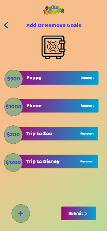
Completing daily chores can be inconsistent and hard to keep up with. Grow Together is a great way to turn it into an easy and fun experience to teach them responsibility. By rewarding their completed chores with rewards created by the parents themselves!
The Process
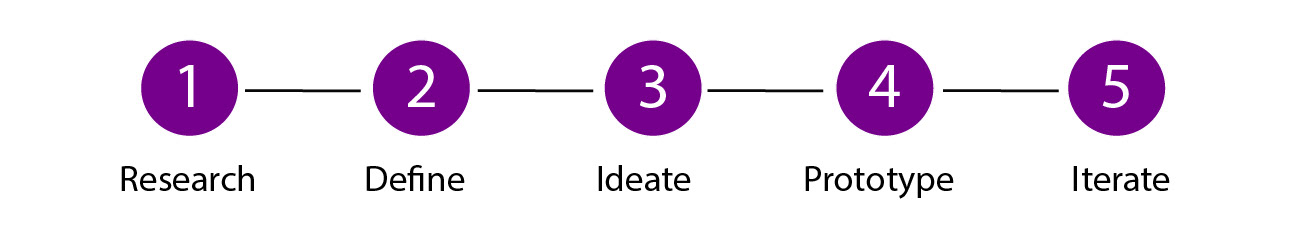
Research
Competitor Analysis
To get a better understanding of the competitor landscape, I conducted analysis on two of the most popular virtual allowance trackers for kids and parents mobile/web apps on the market.
I found that while both provided good and valuable information for the parents to read through, the information was too much which can result in the viewers to be overwhelmed, especially those new to this type of app.
Interviews
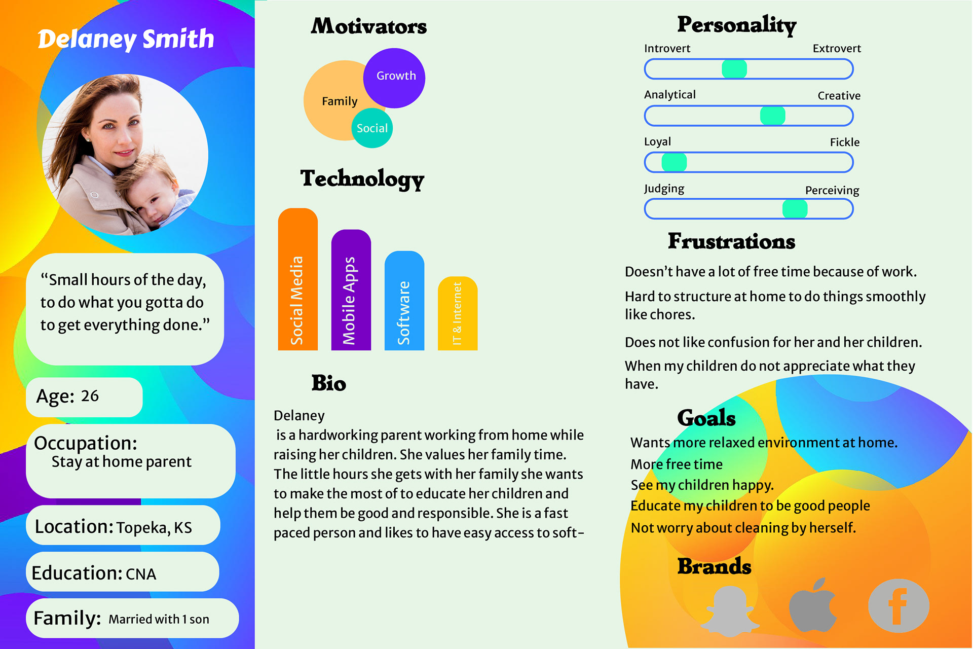
With the goal of providing an enjoyable experience for the kids and parents while teaching them responsibility, I interviewed people specifically parents that were a part of the target audience to discuss what features they thought were most important and the issues they were facing handling everyday life with children under their care.
I interviewed five parents (of varying skill levels but with their own unique daily life schedules. They helped me understand more about the needs and frustrations of my users and I was able to pull a few key findings that would help shape my project:
Easy
I knew taking a simplistic approach with less quantity and more quality would make the app easy to understand.
Educational
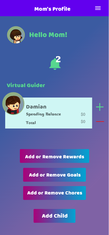
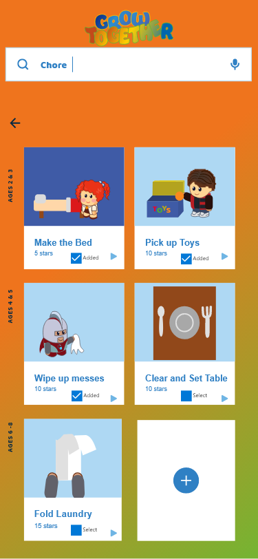
Each child is unique and special in their own way. I decided the parents should be in charge of what their children has access to do that can suit each of their skill level.
Family
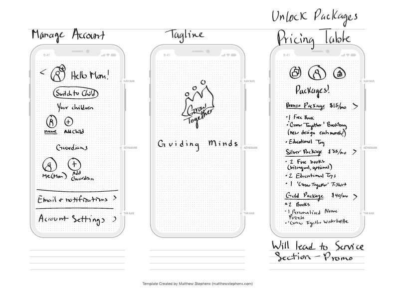
Users were interested in staying connected expressed how important it is to bond with their kids. I decided to include optional monthly subscriptions to earn Grow Together merchandise, educational toys and books for the family to enjoy with cancellation at time!
Define
Problem Statement
Users of any skill level need a way to obtain an easy, fast, and reliable virtual chore tracker app that requires no browsing through with ease. Let's face it, a parent's job is never done, and we need a reliable app to help teach their children in their own way.
One of the key findings from my user research was the fact that most parents want to raise their children their own way and bond at the same time.
One user persona was created, based on my user research. They helped to remind myself of their needs and frustrations, and to maintain a user-centric focus for the duration of the project.
Task Analysis
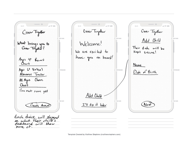
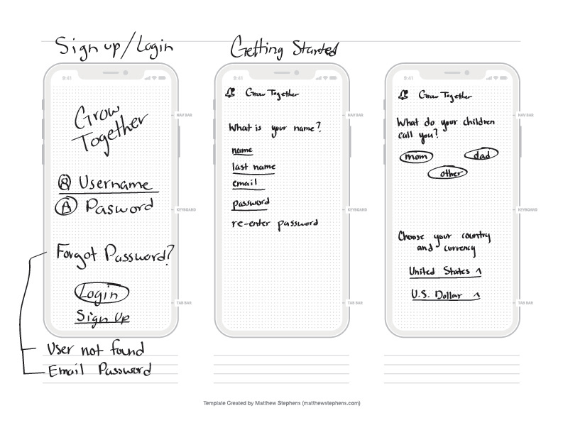
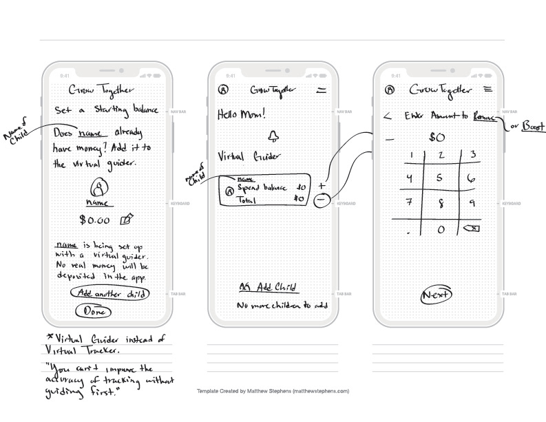
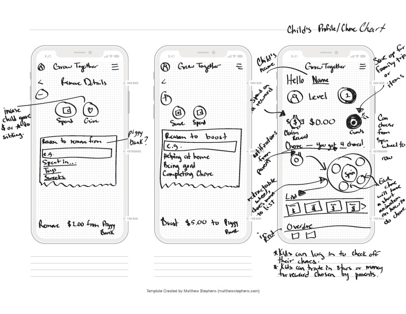
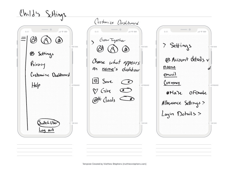
I conducted a Low fidelity wireframe to gain insight as to how users might expect the content to be organized and displayed and used the results to create a sitemap.
Ideate
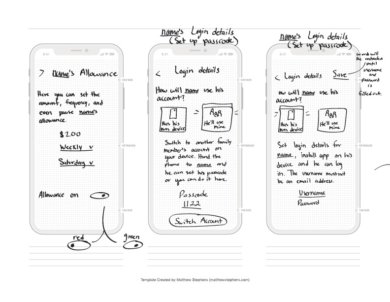
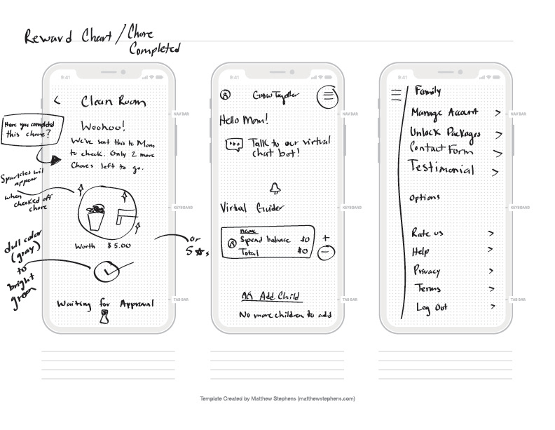
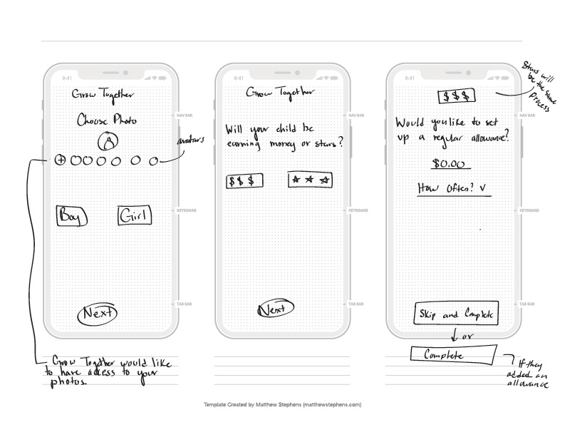
Low Fidelity Wireframes
I wanted to create a limited number of screens as possible since the goal for this project is to be useful, easy, and fun for all ages. I started with pen and paper wireframes and created multiple versions of each screen until I found the right features and elements needed by the users.
Test
Usability Testing
Now comes the joyous moment of conducting usability tests. I was able to refine features that were considered useful and completely change up what did not fit well.
Key Findings
I made notes of the positive and negative results, so that I knew what areas to keep expanding upon and what needed to be reworked.
Positive
1. Users (kids) will be able to complete tasks quickly.
2. Users enjoyed the fun and easy experience.
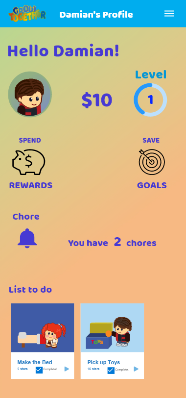
3.Parents assigned their prioritized chores to their kids and chose which rewards they can receive once they earned their points/allowance along with other fun features.
4. Navigation proved easy to understand.
5. Parents love the idea of being in charge! While also allowing their children the chance to make smart decisions.
Negative
1. Had trouble finding information.
2. Found some icons to be too small.
3. Colors were a bit distracting for the adults
Iterate
Design Changes
I made changes based on feedback from my professor and fellow designers. I created a newer high-fidelity version of the app that featured larger icons, decent colors that weren't too distracting and clearer text.
I applied the gestalt principles, color theory and made sure the designs stated consistent and which ones correspond to the right space.


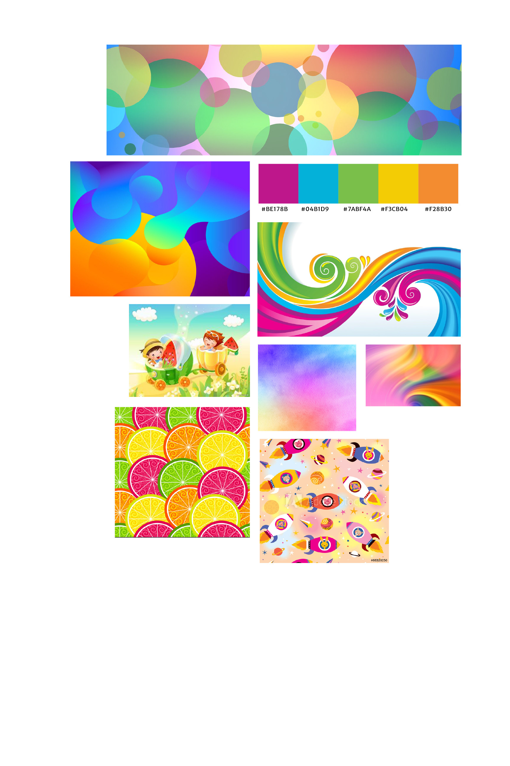
Mood Board
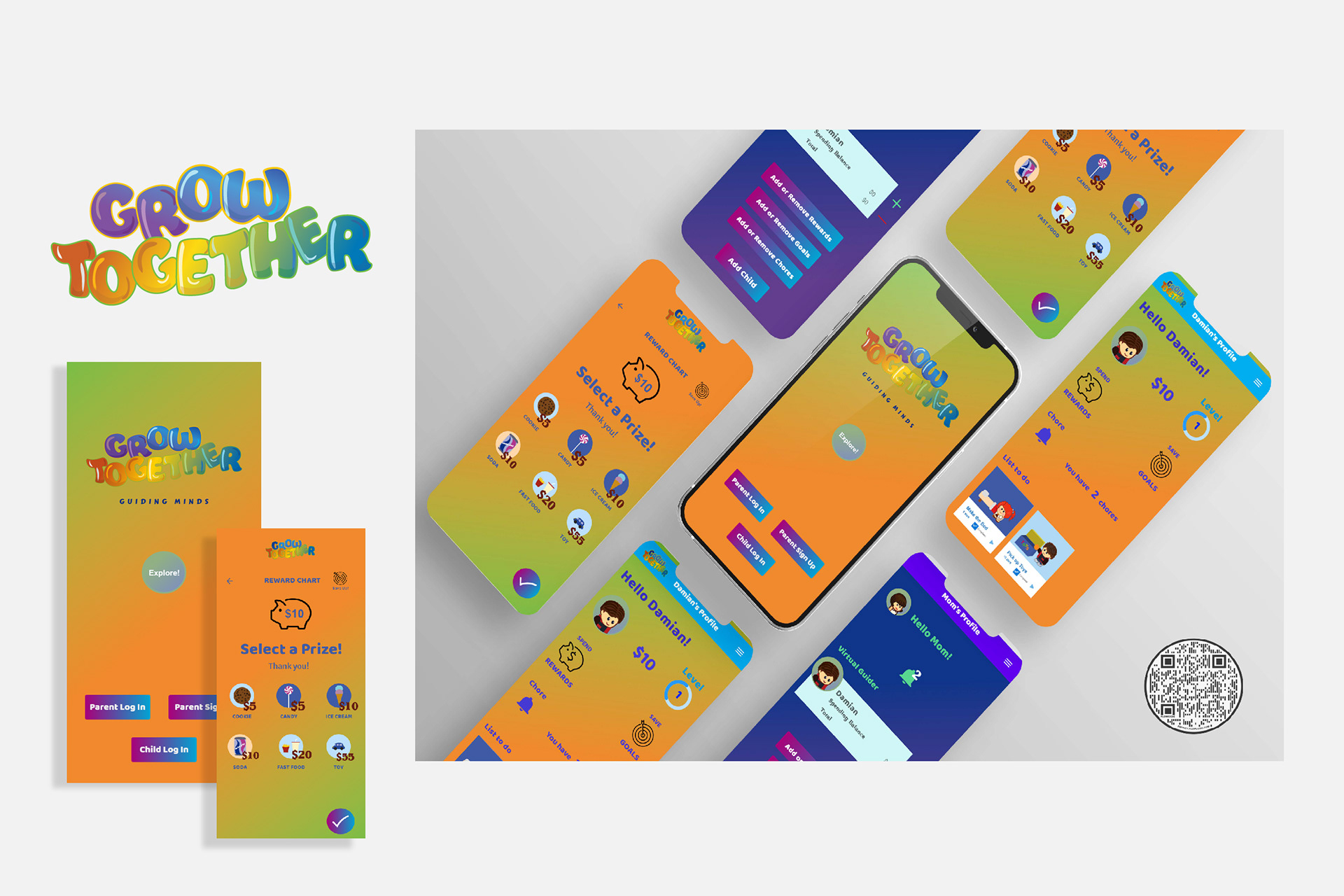
Final Product
After many tests and iterations, the three core features were set in place to be easy and educational while appearing fun and easy to read.
Retrospective
Challenges
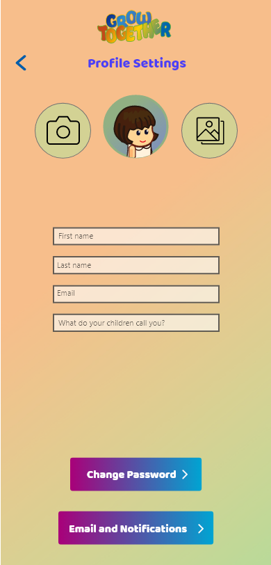
My biggest challenge was a struggle with visualization for the user's profile. Making sure each icon has its clear purpose for the user to easily understand and also displayed beautifully.
This pushed back my timeline somewhat, and I could not spend enough time on some other aspects of the design, such as text.
What can be improved?
I only used Adobe XD and Adobe Illustrator for this project, for everything from my wireframes and prototypes to creating illustrations and icons.